
Cedarville University Logo
Cedarville University Logo
The Cedarville logo is made up of three components: the "pillar" mark, the "Cedarville University" wordmark, and the trademark. These components are always placed in a fixed relationship and should never be altered or modified in any way, other than that which is allowed by this brand guide. When reproducing the logo, use only the artwork supplied from the downloads section of this website.
The Cedarville logo has two states, horizontal and vertical.


Logo Mark
The University logo mark is a visual illustration of our tagline, “For the Word of God and the Testimony of Jesus Christ.”

Cross
Everything we do, everything we are, is because of the substitutionary sacrifice that Jesus Christ made for us on the cross of Calvary. We are justified because of His shed blood and saved by grace through faith alone. The cross is of first importance at Cedarville.
For I delivered to you as of first importance what I also received: that Christ died for our sins in accordance with the Scriptures.
– 1 Corinthians 15:3

Pillar
Founded in 1887, we provide an education marked by academic excellence and grounded in biblical truth. Standing strong with compassionate conviction amid cultural and social pressures, we engage the lost with the Gospel of Jesus Christ.
He is like a man building a house, who dug deep and laid the foundation on the rock. And when a flood arose, the stream broke against that house and could not shake it, because it had been well built. – Luke 6:48

Word of God
God reveals Himself to His people through His inspired, infallible, and sufficient Word. We want all of our students, faculty, and staff daily to study, meditate, and memorize God’s Word, which transforms lives through the Holy Spirit. God’s Word illuminates every decision made, every course taught, and every program offered at Cedarville University.
Your word is a lamp to my feet and a light to my path. – Psalm 119:105
Wordmark
Although the primary Cedarville logo includes the pillar mark, there are cases where it is permissible to use the wordmark alone.

Trademark
Cedarville University holds a Certificate of U.S. Trademark Registration (No. 4063778) from the U.S. Patent and Trademark Office for this logo. The registration is valid until September 1st, 2030, and will be renewed thereafter. The Cedarville name and visual elements are unique trademarks of Cedarville University. A copy of the certificate is available by contacting the Cedarville University Business Office.
To maintain the registration, you must include the ® symbol. Failing to display the ® symbol may result in a cancelation of our registration.
The size of the ® symbol may change depending on the size of the logo being printed, as long as the symbol is legible. It must always be located in the lower right-hand corner of the logo. The color of the ® symbol must match the color of the wordmark.
Clear Space
To ensure its integrity and visibility, the Cedarville logo should be kept clear of competing text, images, and graphics. It must be surrounded on all sides by an adequate amount of clear space. As a general guideline, the empty margin surrounding the logo should be based off of the height of the capital letter "C" in "Cedarville."


Don'ts
The Cedarville logo should never be modified, altered, or reproduced in any way. This following represents a sampling of improper usage of the logo. Please be sure to follow this guide carefully when applying the University logo to materials.

Do NOT add additional elements to the logo

Do NOT alter the arrangement of the logo elements
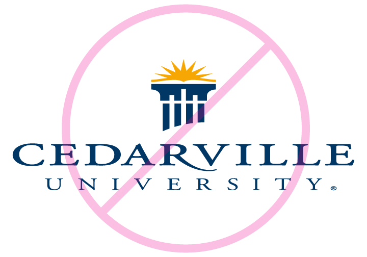
Do NOT extend the logo
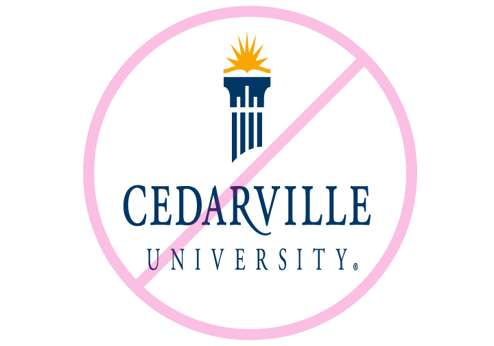
Do NOT condense the logo
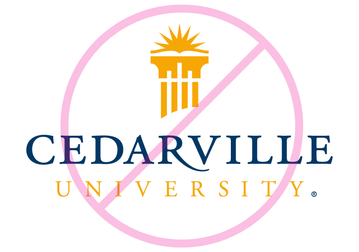
Do NOT mix brand colors
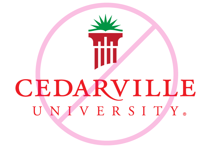
Do NOT use non-brand colors

Do NOT re-create or change the font

Do NOT tilt or offset the logo
Color
The coloration of the Cedarville logo is an essential element in setting a recognizable look and feel for the identity. Consistent use of color enhances the strength of the identity. The Cedarville logos must always use the primary color palette.
Primary Color Palette

Spot: Pantone 2955 C
Process (CMYK): 100/57/9/59
Screen (RGB): 0/57/99
Web (HEX): #003a63

Spot: Pantone 130 C
Process (CMYK): 0/30/100/0
Screen (RGB): 253/185/19
Web (HEX): #fdb813
Which color model should I use?
Spot (Pantone) — This color model is used to specify and print colors in which each color is printed with its own ink. The University letterhead is a good example. Pantone 2955 (blue) and 130 (gold) are the only inks used. T-shirts are also a common example. Each color printed on the shirt uses a different color ink identified by a Pantone number.
The biggest benefit of using spot colors is color consistency. Since inks are being mixed to create the color, there will be no variation throughout a print run. Another benefit is cost savings. Reducing the number of colors will reduce overall costs.
Process (CMYK) — This color model is used when printing with four inks or toner (cyan, magenta, yellow, and black) to produce other colors. While industrial offset presses use this method to print large quantities of brochures and magazines, this is also the method used by color copiers and printers.
Screen (RGB) — Your computer monitor displays graphics by mixing red, green, and blue light. Light and ink mix differently, so for any color being used on screen for a website, PowerPoint, video, screensaver, etc., should use RGB color values.
The largest benefit of this color model is that there are significantly more colors available. Have you ever noticed how photos are always more colorful and vibrant on your computer screen than when they are printed? Avoid using RGB colors when printing because many of the bright colors will shift when printed using cyan, magenta, yellow, and black inks.
Web (HEX) — HEX values are another form of screen color and are mainly used in web design.
Color Variations
Due to budget and print method limitations, there are approved reasons to use the following alternative color variations. For specific information on color, please refer to the University Color Guide.

White with Gold
Use the white with gold (pantone 130) version when printing on a dark background or photograph.

White
Use the white version when printing on a dark background or photograph.

1-Color With Tint (spot, 40% tint of sun)
Use the tinted 1-color version when printing with Pantone 2955 and shading is possible (1-color offset press).

1-Color (spot)
Use the 1-color spot logo when printing in Pantone 2955 and shading is not possible (screen printing).

Grayscale (50% tint of sun)
Use the grayscale logo with tinted sun when printing in black where shading is possible (standard copier, black and white laser printer).

Black
Use the black version of the logo when shading is not possible and/or color is not applicable (embossing, engraving, embroidery).

2-Color (spot or process)
Use this 2-color version when printing in full color (color copier/printer, CMYK offset press, etc.), or printing Pantone colors 130 and 2955 (offset press, screen printing, embroidery, etc.). Use this logo also when presenting on screen (web, PowerPoint, video, etc.).
Logo on Background
Adjust the color variation based on the background brightness when printing on light colored, dark colored, textured, or photographic backgrounds. On a photographic or textured background, the Cedarville logo can be used in color or reversed-out in white. Because every image is different, be sure to choose a color with a strong contrast to the background. Place the logo in an area of the image that is not busy in order to enhance legibility.


